
Design System Development
Document and build reusable design tokens, accessible UI components and shared pattern libraries.
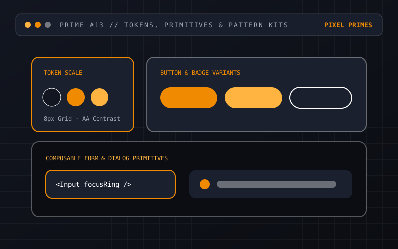
Without a shared system, every new feature invents slightly different buttons, spacing values and modal behaviours. We build pragmatic design systems that bridge Figma and production code through shared tokens and accessible primitives.
01 · The Problem We Solve
Why teams invest in Design System Development.
Visual drift and duplicated CSS slow down product delivery. When accessibility and responsive behaviour have to be re-solved from scratch on every ticket, quality becomes uneven across the product.
02 · Who This Is For
Intended audience & fit.
- →Product and engineering teams shipping across multiple web apps, micro-sites or squads.
- →Organisations where designers and developers spend too much time debating spacing, colours and basic control states.
- →Companies preparing for a rebrand or platform consolidation that needs a single source of truth.
03 · Scope & Process
How we deliver Design System Development.
Interface Audit & Token Architecture
We inventory existing UI patterns and define semantic design tokens for colour, typography, spacing, elevation, radii and motion.
Core Component Design & Code
We design and code foundational primitives—buttons, inputs, selects, dialogs, tables, alerts, cards and navigation patterns.
Accessibility & State Baking
We bake keyboard navigation, focus rings, ARIA attributes, high-contrast resilience and reduced-motion support directly into each primitive.
Usage Documentation & Governance
We write clear dos/don’ts, prop tables and composition examples so designers and engineers know how and when to use each component.
04 · Practical Benefits
Outcomes you can measure.
- ✓Faster feature assembly because standard controls, layouts and states are already solved and tested.
- ✓Visual and behavioural consistency across every route and product surface.
- ✓Accessibility compliance handled once at the primitive level rather than patched screen by screen.
- ✓Direct alignment between Figma variables and CSS/TypeScript tokens.
05 · Concrete Deliverables
What we hand over.
- •Design token specification (CSS custom properties / JSON / Tailwind config)
- •Structured Figma component library with variants and auto-layout
- •Coded React/TypeScript component primitives with full keyboard and ARIA support
- •Living documentation or pattern gallery showing states, props and usage guidelines
- •Adoption and contribution guide for internal teams
06 · Scope Boundaries
Clear limitations.
- !A design system succeeds when adopted; we build pragmatic sets of high-leverage components rather than hundreds of speculative variants nobody uses.
- !Full migration of legacy screens to the new system can be phased incrementally alongside your team’s release schedule.
07 · Common Questions
FAQs about Design System Development.
How big does our product need to be to justify a design system?
Even a single growing product benefits from a lightweight token scale and 15–20 core primitives. You do not need a 200-person organisation to save time with shared components.
Do you deliver Figma files, code or both?
Both. A design system that only exists in Figma still leaves engineers reinventing CSS; delivering matched tokens and coded components closes the gap.
How do you handle dark mode or multi-brand theming?
We structure tokens in two layers—raw palette values and semantic role tokens (like --bg, --surface, --fg, --accent)—making theme switching a clean variable swap.
08 · Related Capabilities
Complementary services.
UI/UX Design
Research, user flows, wireframes and accessible interface design grounded in clear logic.
Frontend Application Development
Develop resilient, reusable React and TypeScript interfaces, data visualisations and component architectures.
Website Accessibility Improvements
Evaluate and remediate key user journeys against WCAG 2.1 / 2.2 accessibility standards.
09 · Start a Conversation
Enquire about Design System Development.
Share your current setup, goals and any target dates. We reply within two Australian business days with practical next steps.
info@pixelprimes.com.au · +61 426 017 562
Level 7, 185 Victoria Square, Adelaide, SA 5000
ABN 59 703 809 036